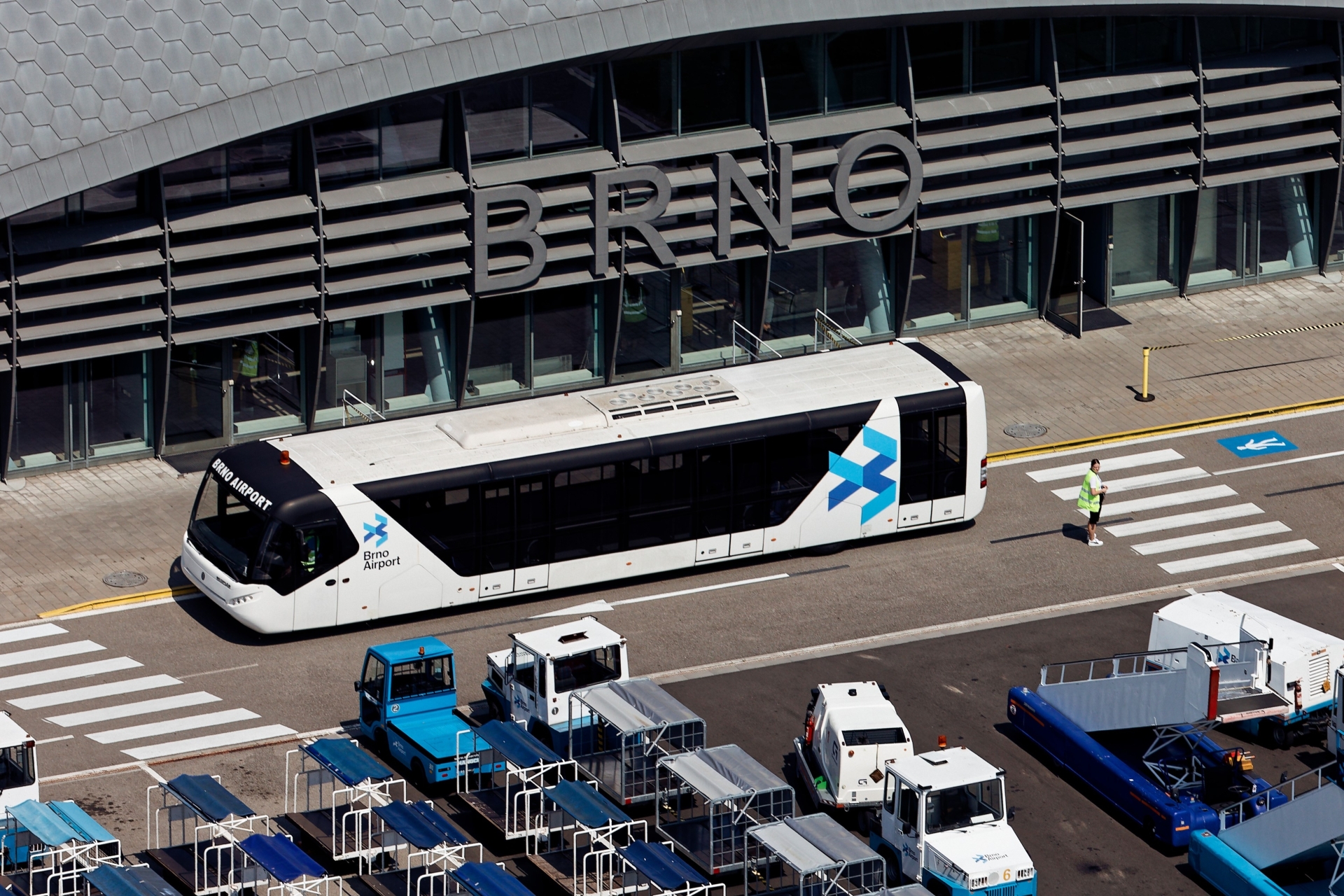
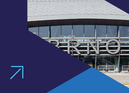
A key element of the change is the redesigned logo, which combines a stylised bird motif – a symbol of flight and freedom – with the letter B, referring to the name of the city of Brno. The logo consists of six slanted rectangles arranged in a composition inspired by the silhouette of an aeroplane. This element visually expresses the nature of air transport, and its repetition creates the impression of air traffic and movement in the sky.
The new identity also includes original iconography, which is used in the navigation system, in the design of airport equipment and other operational areas, as well as on the airport's website and social media.
The rebranding also introduces a new typography and colour scheme. The airport now uses the Neue Haas Grotesk font. The colour palette follows the visual style of the Accolade group and uses its signature blue colour. This remains a key element – not only for its connection to the sky and flying, but also for the feeling of trust and stability it conveys. Three shades add functionality and depth. Light blue symbolises clarity and openness and helps highlight motifs that are intended to attract attention. Dark blue brings strength and contrast, making the text easy to read on signage and screens. Neutral blue acts as a connecting tone between the lighter and darker variants.
"Creating a new identity for Brno Airport is a natural step that reflects its current dynamics and direction. We want it to appear trustworthy and modern, and its visual presentation to correspond to what it really is – a gateway of European significance," said Eduard Piňos, Chief Marketing Officer at Accolade, which owns the operator of Brno Airport, LETIŠTĚ BRNO a.s. "The rebranding is also closely linked to the redesign of the airport's website. It too is designed to meet the latest UX standards and help visitors quickly find all the information they need about airport operations, regardless of the type of device they are using to view it."
The appearance and functionality of the website follow the example of the top websites of leading European airports, both in the desktop and, above all, mobile versions. The new site offerr intuitive, clear navigation, a comprehensible content structure and flexible management options. The website was created in collaboration with the Brno-based development studio Superkoders.